An average can look perfectly healthy while hiding a tail of extreme answers. In the Staff Experience Survey sample, the NPS question averages 7.53 out of 10, a number most managers would happily report. But the same widget shows a skewness of -1.26 and 19 outliers, a pocket of very unhappy staff the mean smooths over. This article walks through the rows in PaperSurvey's Descriptive Statistics widget that reveal distribution shape, quartiles, skewness, kurtosis and the Tukey outlier count, and shows how they map to our free Percentile Calculator, Skewness and Kurtosis Calculator and Outlier Calculator.
Two real distributions, side by side
We will compare two questions from the sample surveys:
- "How many hours of sleep do you get on a typical work night?", a Number question from the Employee Wellbeing Study (291 of 300 respondents answered)
- "How likely are you to recommend this workplace to a friend or colleague?", the 0-10 NPS question from the Staff Experience Survey (188 responses)
Both are read through the same widget. The Statistical Deep-Dive view is created for you automatically and already contains one, or you can add your own:
- Open your survey, go to Analysis and open a view (or click + New View).
- Click Edit, then Add to open the Add blocks drawer.
- Under Advanced stats, pick Descriptive Statistics and choose the question in the inspector.
A freshly added widget shows every statistic in the catalog, including all the shape rows below, so there is nothing extra to switch on. Use the Statistics to show checkboxes to untick anything you do not need. The widget recomputes whenever responses arrive or the view's filters change.
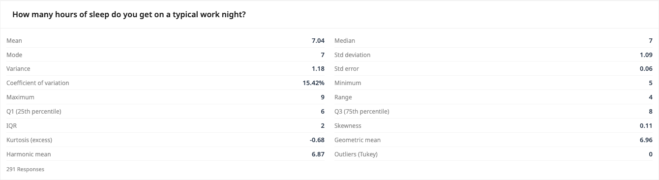
The sleep question is what a well-behaved distribution looks like: Mean 7.04 and Median 7 sit on top of each other, Skewness is 0.11, and Outliers (Tukey) reads 0.
Quartiles: Q1, Q3 and the IQR
The Q1 (25th percentile), Median, Q3 (75th percentile) and IQR rows split your responses into quarters. For the sleep question, Q1 is 6 and Q3 is 8: half of all staff sleep between 6 and 8 hours, and the IQR of 2 measures that middle spread without being pulled around by extremes the way the standard deviation is.
PaperSurvey computes exactly these three percentiles, the 25th, 50th and 75th. No widget or chart can display an arbitrary percentile such as the 90th or 95th. When you need one, export the responses (see below) and use the Percentile Calculator on the pasted values, or compute it in SPSS, R or Excel.
Skewness and kurtosis: quantifying the tail
Now the NPS question from the Staff Experience Survey:
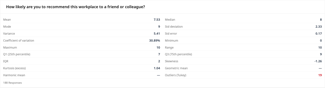
- Skewness is -1.26. Negative skewness means a long tail on the low side. You can see the classic signature in the location rows too: Mean 7.53 is below Median 8, which is below Mode 9. Most staff answer 8 or 9, but a minority of very low scores drags the mean down.
- Kurtosis (excess) is 1.04. Positive excess kurtosis means the tails are heavier than a normal distribution's, so extreme answers are more common than the standard deviation alone suggests. The sleep question's -0.68, by contrast, describes a slightly flat distribution with almost no tail at all.
Both statistics use the same Excel-style sample definitions as the Skewness and Kurtosis Calculator, so pasting exported values into the calculator reproduces the widget's figures. As a rule of thumb, skewness beyond about plus or minus 1 means the mean alone is a misleading summary and you should report the median and quartiles alongside it.
Counting outliers with Tukey fences
The Outliers (Tukey) row counts answers that fall outside the standard Tukey fences: below Q1 - 1.5 x IQR or above Q3 + 1.5 x IQR. The count turns red whenever it is not zero, and the Outlier Calculator applies the identical rule to pasted values.
The widget shows only the count, not the fence values or the flagged answers, but you can derive the fences from the rows on the card. For the NPS question, Q1 is 7 and IQR is 2, so the lower fence is 7 - 3 = 4 and the upper fence is 9 + 3 = 12. Anything below 4 is flagged, and 19 respondents scored 0 to 3. The upper fence sits above the scale maximum, so there are no high outliers.
This example also shows when bounded scales produce outliers. A 0-10 scale usually cannot exceed fences built from its own quartiles, and most Range or NPS questions will show 0 here. But when answers cluster as tightly as these do (half of all staff between 7 and 9), the fences land inside the scale and genuinely unusual answers get flagged. On open-ended Number questions, where a stray 70 can sit among answers of 7, the row is at its most useful. One small caveat: the count needs at least 4 responses, below that it simply shows 0.
Inspecting the actual outliers
To see who the 19 low scorers are, export the data rather than hunting in the app. The Responses list can filter a Number question only by an exact value, with no less-than or range option, so the fences are easier to apply in a spreadsheet:
- Open the Responses tab and click Export.
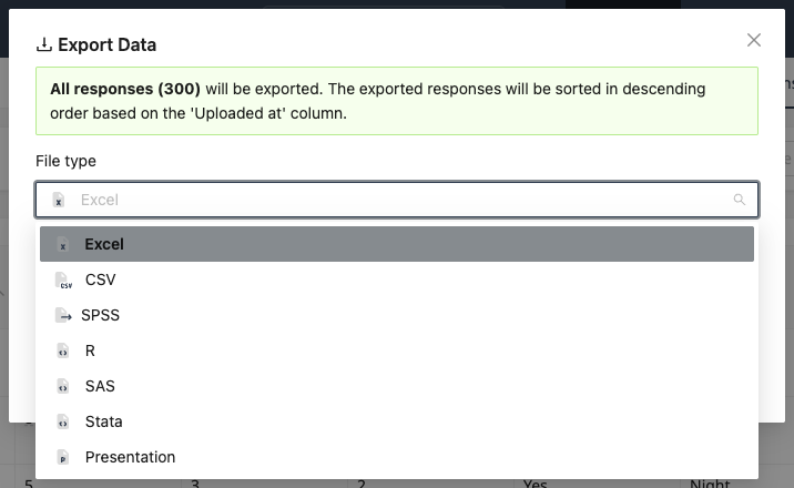
- In the Export Data modal, pick a File type: Excel, CSV, SPSS, R, SAS, Stata or Presentation.
- In Excel, sort or filter the question's column against your fences (here, values below 4).
For deeper work, the SPSS export is the cleanest route: the .sav file declares codes like "no response" as user-missing, so they cannot distort a mean, standard deviation or percentile computed downstream.
Z-scores: standardizing individual answers
A z-score expresses one answer as the number of standard deviations from the mean, which is another common way to define an outlier (beyond plus or minus 3, for instance). PaperSurvey never computes z-scores of respondent values, but it supplies both ingredients: the Mean and Std deviation rows of the widget, or the Mean and Std Dev footer under numeric charts on Results. Standardize after export with SPSS (DESCRIPTIVES with /SAVE), R (scale()) or a plain (x - mean) / SD formula in Excel, or check a single value with the Z-Score Calculator.
One thing not to confuse: the z-scores checkbox on the Compare Responses tab (visible in Advanced mode when the Table or Both view is active) overlays adjusted standardized residuals on cross-tab cells. Those measure how far a cell deviates from independence between two questions, not how unusual an individual answer is.
Before you trim anything
An outlier flag is a prompt to investigate, not to delete. On a paper survey, first rule out a scanning or handwriting misread by opening the flagged entries and checking the scanned page. If the answers are real, they are often the most important responses in the dataset, the 19 staff scoring 0-3 are exactly the people a retention plan is for. If you do exclude values for a statistical reason, report it, and remember that medians, quartiles and the IQR barely move either way, which is why this widget leads with them.
Next steps
- Descriptive statistics for survey data for the spread and precision rows on the same widget
- Filtering data in analysis to recompute the shape statistics for one department or time period
- Exporting survey data for the Excel, SPSS and R workflow in detail
- Outlier Calculator to run the Tukey fence rule on your own numbers