An A/B test on paper works exactly like one online: two versions of something (a flyer, a cover letter, an incentive), one binary outcome, and a statistical test that tells you whether the difference you see is real. The Response plan in a survey's Settings sizes a survey for a single percentage across the whole sample, so it will not size the two arms of a test, and statistical power is not computed anywhere in the app. Planning an A/B test therefore still happens before you print, in the free A/B Test Sample Size Calculator, and the app then runs the significance test on the collected responses automatically. This article walks through the full loop using real figures from a demo PaperSurvey account.
Plan the sample size before you print
The most common A/B testing mistake is stopping too early with too few responses. Before printing anything, open the A/B Test Sample Size Calculator and fill in four inputs:
- Baseline rate (%), the outcome rate you see today, for example the registration rate your current flyer achieves.
- Expected rate (%), the rate that would make the new version worth adopting.
- Confidence level, usually 95%.
- Statistical power, usually 80%.
The result is a Sample size per group, the number of completed responses each arm needs before the test can reliably detect that difference. Small lifts need surprisingly large groups, which is exactly why you calculate this before printing rather than after running out of forms.
Design the survey: one group question, one outcome question
The survey itself only needs two Single choice questions: one recording which version the respondent received ("Which flyer did you receive?" with options Version A and Version B) and one recording the binary outcome ("Did you register?" with Yes and No). Everything else is optional context.
To track each arm's fieldwork toward the per-group target, print each version's forms as its own batch and open Prints in the main navigation. The Generated Prints page lists every batch with a Copies Requested column and an Uploaded column in the form "X / Y", processed returns out of the copies in that batch. One caveat from the column's own tooltip: if you reprint a batch reusing the same identifiers, the counter can become inaccurate, so keep one batch per print run.
The demo data
The screenshots below come from the demo Employee Wellbeing Study, 300 respondents, where "Do you exercise at least twice a week?" plays the role of the group question and "Have you taken a sick day in the last month?" is the binary outcome. This is an observational pairing rather than a randomized experiment, but the arithmetic is identical to a flyer test: two groups, one yes/no outcome, one 2×2 table.
Read the verdict on Compare Responses
- Open the survey's Analysis tab and switch to the Compare Responses tab.
- Under "How do responses differ based on:" pick the group question. The page then cross-tabulates it against every other eligible question automatically.
- Switch the toggle at the top right from Simple to Advanced to see the full statistics.
The card for the outcome question shows the cross-tab table, and the page's Chart/Table/Both control can add side-by-side bars. In the demo, 21 of the 168 respondents who exercise took a sick day (12.5%), against 45 of the 132 who do not (34.1%). The stats footer reads χ² = 20.0811, df = 1, p < 0.0001, with the green verdict Sig. (Fisher), Fisher p < 0.0001, V = 0.2587 (Small) and MoE ±5.7%.
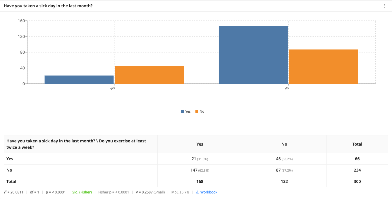
Because this is a 2×2 table, PaperSurvey runs Fisher's exact test alongside chi-square and treats it as the primary verdict. Fisher's test is exact at any sample size, which matters for A/B tests where one cell can end up small. The page also reminds you that these comparisons are exploratory, and Cramér's V gives you an effect-size label so a significant but tiny association does not get oversold.
To show your work, click the card's Workbook link (labelled Download workbook in Simple mode). It downloads an Excel file with the observed and expected frequencies and a step-by-step chi-square sheet built on live =CHISQ.DIST.RT formulas, so a colleague can audit every number.
Quantify the effect with the Odds Ratio widget
Significance says the difference is real. The odds ratio says how big it is, in the units most journals and stakeholders expect for binary outcomes.
- Open an analysis view on the Analysis tab and click Edit.
- Click Add and pick Odds Ratio from the Advanced stats category of the Add blocks drawer.
- In the inspector, set the Exposure question and its Positive option (here the exercise question, positive option Yes), then the Outcome question and its Positive option (the sick day question, Yes).
The app builds the 2×2 contingency table from the actual responses. The card shows three statistics: Odds ratio 0.27, Relative risk 0.36 and 95% CI 0.1543 to 0.4942, with the underlying cell counts shown beneath as a small "2×2 counts: a=21 b=147 c=45 d=87 (n=300)" line.

Reading it in plain English: the odds of a sick day among exercisers are about a quarter of the odds among non-exercisers, and the relative risk of 0.36 means exercisers were roughly a third as likely to take one (12.5% versus 34.1%). In a flyer test you would set the new version as the exposure and registration as the outcome, so an odds ratio above 1 with a confidence interval that stays above 1 favors the new design. Relative risk is usually the easier number to communicate, while the odds ratio is the standard for reporting.
A few honest limits of the widget:
- The confidence interval is fixed at 95%. For other levels, export the data and compute externally.
- The card shows no p-value. Use the Fisher verdict on Compare Responses for significance on the same pair.
- Only respondents who answered both questions are counted, and questions with more than two options are dichotomized as the chosen positive option versus everything else.
- The widget only builds its table from responses in the survey. For cell counts from outside sources, or to try what-if counts, the free Odds Ratio Calculator accepts the four cells a, b, c and d directly and returns the same statistics.
What to watch out for
The Comparison Chart widget can also put two groups side by side, defined by "Group A includes responses where" filters on another question, for example which flyer version the respondent received. It shows raw counts only, with no significance test, so treat it as a visual companion to Compare Responses rather than a verdict. And if you need anything beyond what the app computes, such as post-hoc power or intervals at other confidence levels, the workflow is always the same: collect with PaperSurvey, export from the Responses tab (Excel, CSV, SPSS, R, SAS, Stata), and finish the calculation in the free calculators or your stats package.
Next steps
- Understand the underlying test in Chi-Square, Cramér's V and P-Values
- Plan fieldwork volumes with How Many Survey Responses Do You Need?
- Get your data out for deeper analysis with Exporting Survey Data
- Size your next experiment with the A/B Test Sample Size Calculator and sanity-check external tables with the Odds Ratio Calculator