PaperSurvey offers a comprehensive set of question types designed for paper-based data collection. Each type is optimized for accurate OCR recognition and easy respondent completion. Understanding the available options helps you choose the right format for every question in your survey.
Selection questions
Single choice
Respondents select one answer from multiple options. The system flags entries with multiple selections for review.

Best for: Yes/No questions, gender selection, single preferences
Multiple choice
Allows selection of one or more answers. You can set maximum selection limits if needed.

Best for: "Select all that apply" questions, interest areas, service preferences
Range
Respondents mark their position on a scale between two endpoints.

Best for: Satisfaction scales, agreement levels, frequency indicators
NPS (Net Promoter Score)
A specialized 0-10 scale with automatic NPS calculation built in.

Best for: Customer loyalty measurement, recommendation likelihood
Discrete choice (conjoint)
Presents a set of alternatives described by a shared list of attributes and asks respondents to pick the one they prefer. Each alternative is a column, each attribute is a row, and respondents mark a single choice. Set it up by listing the attributes to compare and the alternatives with their values. To present several choice tasks, add a separate discrete choice question for each one.
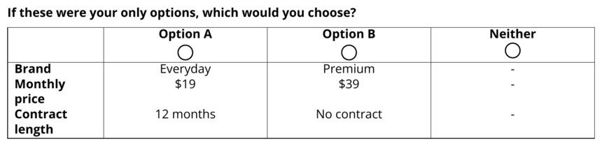
Best for: Trade-off and preference research, product concept testing, pricing and feature comparisons
Forced-choice pairs
Shows two statements, each with an empty checkbox of its own, and asks respondents to mark the one that comes closer to their own view. Set it up by adding a single choice question with exactly two options and setting its Layout to one of the three Pairs options. The first option is the first statement of the pair and the second option is the second. Put several paired questions one after another and they print as one block, with a single shared instruction above the run taken from the help text of the first pair. Write both statements so each one is defensible on its own, keep them roughly the same length, and swap which statement carries which position as you go down the block, so nobody can answer all of it by always picking the same side.
There are three paired layouts, and they differ only in how a pair is arranged on the page. The two-option rule, the scoring, the export columns, the charts and the shared public view are identical in all three, so you can try one arrangement and move to another without redoing any of the setup. Print the form again after a switch, as you would after any other layout change.
Pairs, mark above each statement with a divider is the classic arrangement. The two statements sit side by side, each with an empty checkbox centred above it and a divider line between the checkboxes and the text. Choose it when both statements are short enough to sit on a line or two in half the page. It is the arrangement most printed forced-choice forms use, and it makes the trade-off obvious because the reader takes in the whole pair at once.
Pairs, mark above each statement, no divider is the same side-by-side arrangement with the divider taken out, so the space around a pair holds it together instead. Choose it when a long block turns into a page of stacked lines that looks heavy, or when the form already carries plenty of lines from boxes, dividers and grids. Keep the statements short for this one, because the divider was doing some of the work of showing which checkbox belongs to which statement.
Pairs, one statement per line gives each statement the full width of the page with its checkbox on the left, so a pair prints as two lines rather than two columns. Choose it when the statements are long. A full sentence squeezed into half the page wraps to four or five lines and is unpleasant to read, and this arrangement usually keeps it on one. It is also the one to pick when the survey is set in a large font or in two columns, or in a language with long words, because half of an already narrow column is narrower still. It does not cost you room down the page: a block of short pairs takes much the same height whichever arrangement you choose, and a block of long ones takes less this way. What it does cost is that a pair looks more like an ordinary two-option question, so the shared instruction reminding people to pick one statement in every pair matters more here.
Use one layout for the whole block. Consecutive pairs print as a single run whatever layouts they carry, under one shared instruction, so mixing them only makes the block look inconsistent. A web survey shows the same pairing on screen, with an option button for each statement, and on a narrow phone screen the two statements sit one above the other whichever layout you picked.
To score a block, turn on Activate test grading in Survey Settings, open Answer Key on each pair, switch it to Points per answer, and give one point to the statement that carries the position you are measuring and zero to the other. Then group the pairs in a section, turn on Score this section as one scale, and set the bands you want. Every respondent's marks add up into one total, and the analysis shows the distribution of totals and the band each person falls into.
Forced-choice totals are ipsative, which means they are relative to the person rather than to a fixed yardstick. Each answer is a choice between two things rather than a rating of one, so the total says which of the two positions pulls harder inside that person and nothing about how strongly they hold either. Someone who scores 6 out of 7 is not more committed than someone who scores 3, only more consistent about which side they pick. Read the scores as a comparison of orientations within a person and as a profile across a team, not as an absolute level, and be careful about correlating them with other measures, because the built-in trade-off can produce relationships that are not really there.
Best for: Forcing a trade-off between two defensible positions, values and orientation questionnaires, reducing the agreement bias of rating scales
Grid questions
Single choice grid
Multiple questions share the same answer options, with one selection allowed per row.
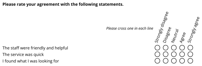
Best for: Likert scales, feature ratings, comparative evaluations
Multiple choice grid
Multiple questions allowing multiple selections per row.

Best for: Feature usage matrices, availability schedules, preference grids
Before/After Table
Each row shows a statement in the middle with the same rating scale on both the left and the right, so respondents rate every item under two conditions in one compact grid. Set it up by defining the shared rating scale once, adding each statement as a row, and labeling the two sides.
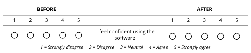
Best for: Before and after comparisons, then vs now retrospective ratings, expectation vs experience, importance vs performance
MaxDiff (best and worst)
A best/worst scaling table. Each row is an item to evaluate, with a choice column on each side, such as "Most important" on the left and "Least important" on the right. Respondents pick exactly one item per side, and the same item cannot be marked as both. Set it up by listing the items to compare and naming the two side labels. MaxDiff works best with 3 to 6 items per block; for longer lists, add a separate MaxDiff question for each block.
Best for: Prioritizing features or messages, importance research, forcing trade-offs that rating scales hide
Ranking
Respondents rank a list of items by marking one rank per item, using each rank only once. Ranking is a ready-made preset of the single choice grid: rank positions such as 1st, 2nd, and 3rd form the columns, and the items to rank form the rows. The preset also adds a helper line reminding respondents to use each rank only once.
Best for: Preference ordering, prioritizing options, ranking candidates or ideas
Text and number input
Number
Numeric input with optional digit limits for structured data collection.

Best for: Ages, quantities, IDs, phone numbers, postal codes
Date
Structured date entry with automatic validation.
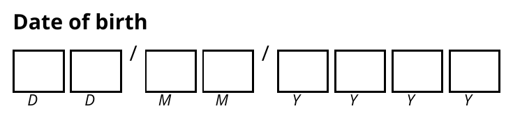
Best for: Birthdates, event dates, deadlines
Date (day/month choice)
A date entered by crossing day and month boxes rather than writing digits, read automatically via optical mark recognition.

Best for: Dates where marking boxes is easier than writing, such as start months or day-of-week selection
A text field validated as an email address, flagging entries that do not look like a valid address.

Best for: Contact capture, follow-up permissions, newsletter sign-ups
Postal code
A field formatted for postal or ZIP codes, with country-specific formats and fixed digit layouts where applicable.

Best for: Addresses, catchment analysis, regional segmentation
Barcode
Reads a barcode or QR sticker (QR, Code 39, Code 128) placed within the field boundaries.
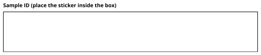
Best for: Linking forms to inventory, assets, samples, or existing records
Inline text and number inserts
Advanced fields embedded directly inside a sentence or block of text, so a short text or number answer sits within your own wording rather than as a separate labeled question. These inserts are a paper feature; on the web survey the insert shows as a blank line within the sentence.
Best for: Fill-in-the-blank phrasing, structured statements, custom inline responses
Short text
Single-line text input for brief responses.

Best for: Names, email addresses, brief answers
Long text
Multi-line text area for detailed responses.
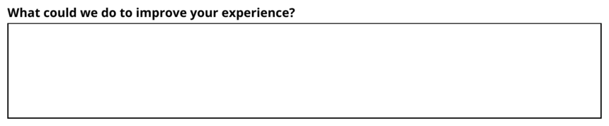
Best for: Comments, feedback, explanations, suggestions
Signature
Captures signatures as images without any additional processing. On the web survey, respondents draw their signature directly on screen.

Best for: Consent forms, agreements, authorization
Layout elements
Heading
Ten heading styles are available with customizable colors: four classic sizes including the filled band, plus numbered sections, side rules, uppercase kickers, centered titles with flanking rules, outlined frames, and short accent underlines. Any heading can also carry a muted subtitle line, and the boxless styles can draw a filled chip behind the text.
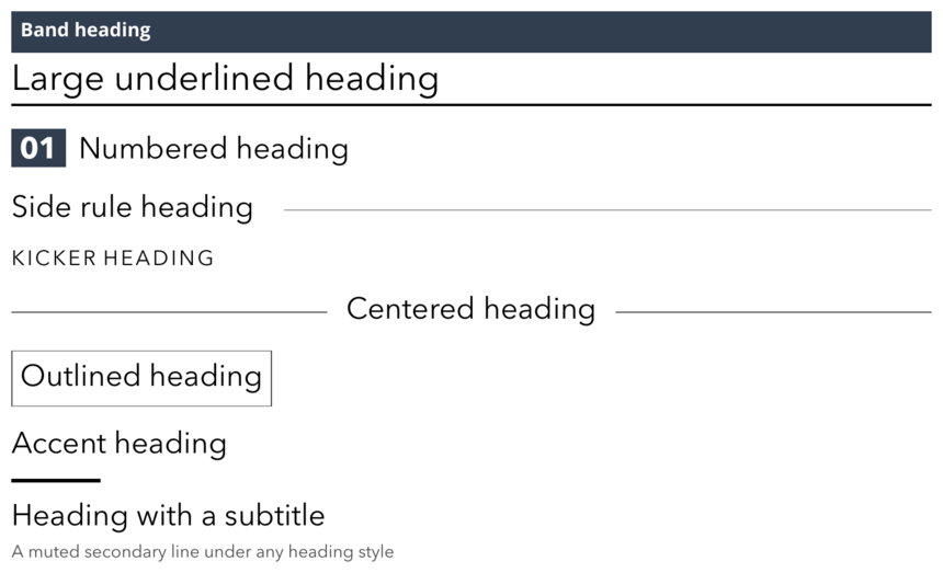
Best for: Section titles, instructions, grouping related questions
Description
A block of descriptive or instructional text that is not a question and collects no answer.

Best for: Instructions, context, consent wording, section introductions
Box
A container that visually groups related content on the page, in four styles: the classic bordered box, a borderless tinted panel, a thin outline, and a titled card with a colored title band.
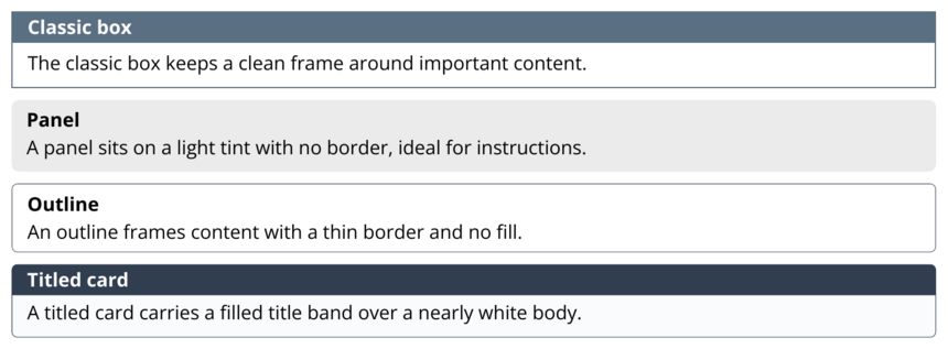
Best for: Highlighting a section, framing instructions, drawing attention
Page break
Forces content to start on a new page.
Best for: Logical survey sections, keeping related questions together
Divider
A visual separator between question groups, available as a classic line in several weights, dotted, double line, ornament, dashed, and centered dots. Any line style can also render short and centered.
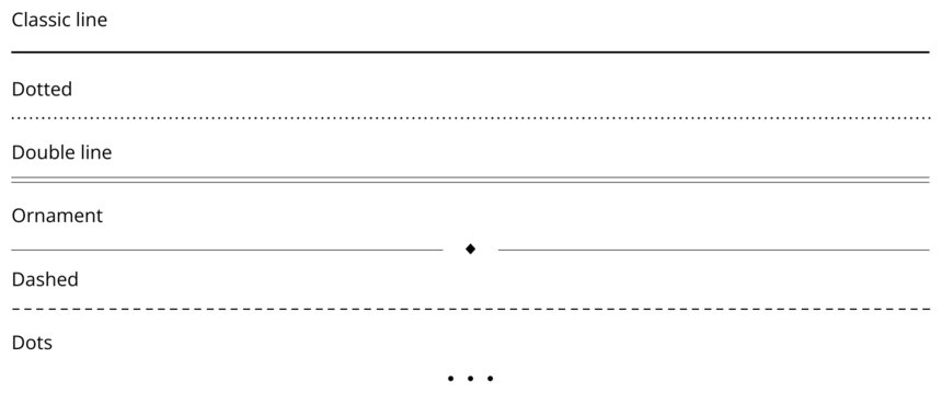
Best for: Visual organization, section separation
Vertical spacing
Adds blank space between elements.
Best for: Improving readability, creating visual breathing room
Multi-column
Groups questions in 2, 3, 4, or 5 column layouts.

Best for: Short questions, demographic data, space optimization
Repeater
Repeats the next set of questions a fixed number of times, saving each repeated block as a separate entry. Use [counter] and [max_counter] in question names for labels such as "Person 1 of 3."
Best for: Rosters, multiple people or items per form, repeated sections
Special
Prefill data
An invisible field that associates prefilled data with a response. It is not shown on the form and collects no answer from the respondent. See the Prefill Data section for setup and bulk link generation.
Best for: Matching responses to known records, tracking codes, mail-merge data
Need a custom question type?
If your survey requires a specialized question format not listed here, contact us at hello@papersurvey.io. We regularly add new question types based on user needs.