PaperSurvey analysis dashboards offer a variety of chart types to help you visualize survey results. The right chart depends on the type of question and what you want to communicate.
Bar chart
Displays response counts or percentages as vertical bars. Works well for comparing values across categories.
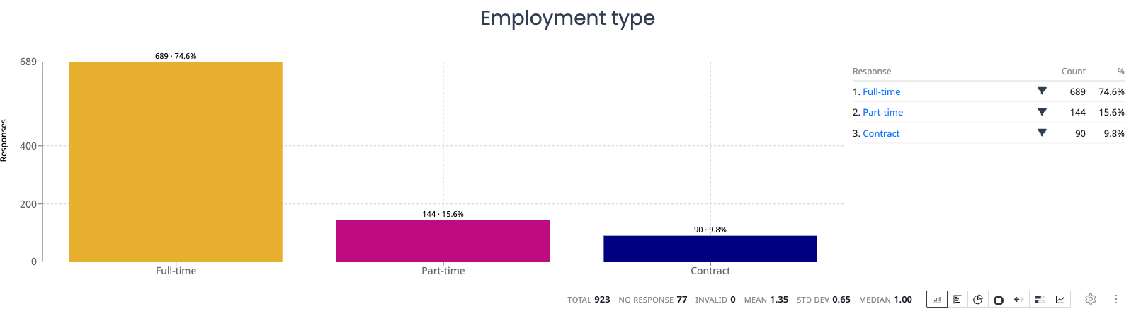
Best for: Single choice questions, multiple choice questions, comparing response frequencies.
Horizontal bar chart
Same data as a bar chart, displayed with horizontal bars. Useful when option labels are long.
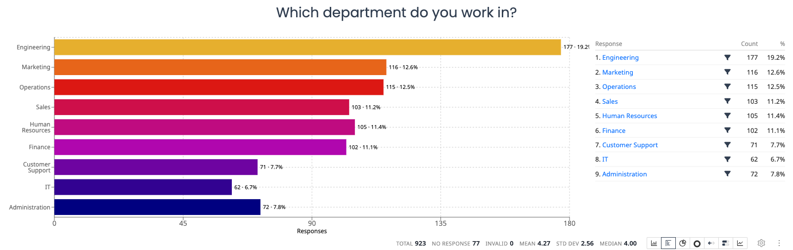
Best for: Questions with many options, long label text, ranked preferences.
Pie chart
Shows each option as a proportional slice of a circle. Most effective with a small number of options.
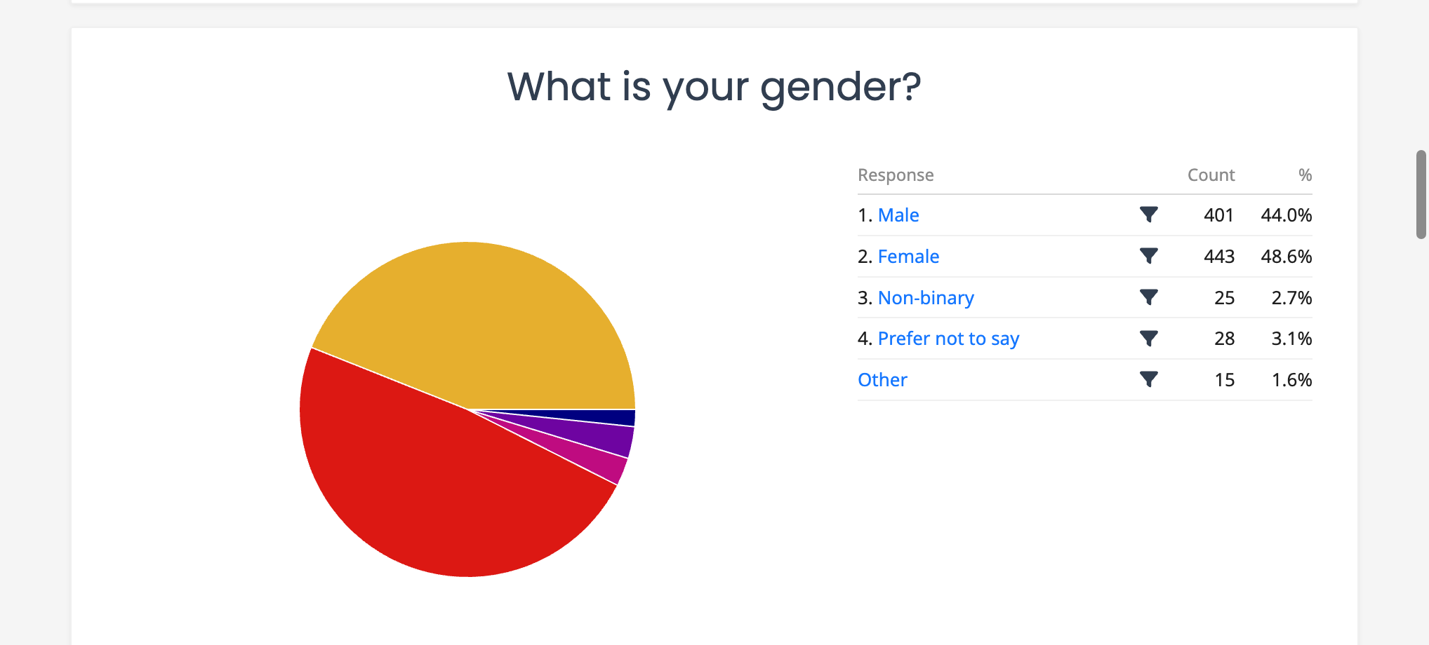
Best for: Single choice questions with 2 to 6 options, showing proportions at a glance.
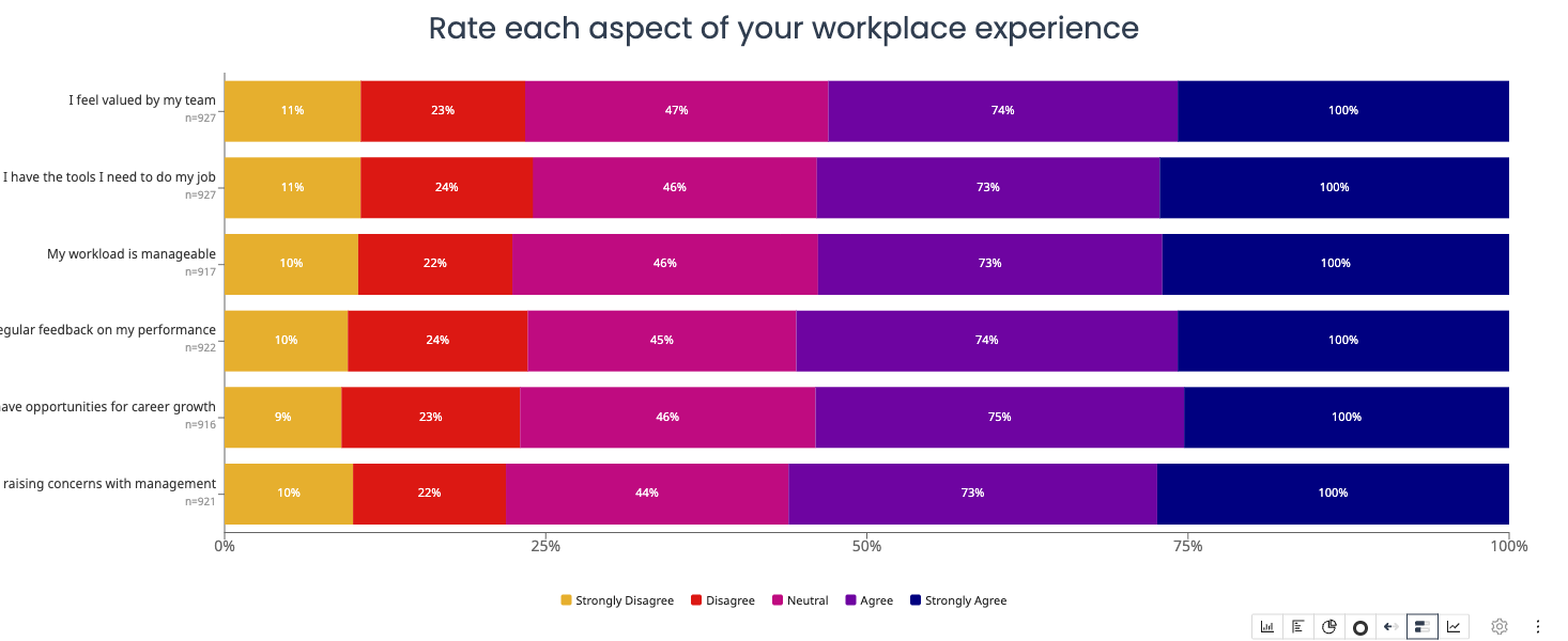
Likert bar
A stacked horizontal bar that shows the distribution of responses across a scale (e.g., Strongly Disagree to Strongly Agree). Each segment represents one scale point.
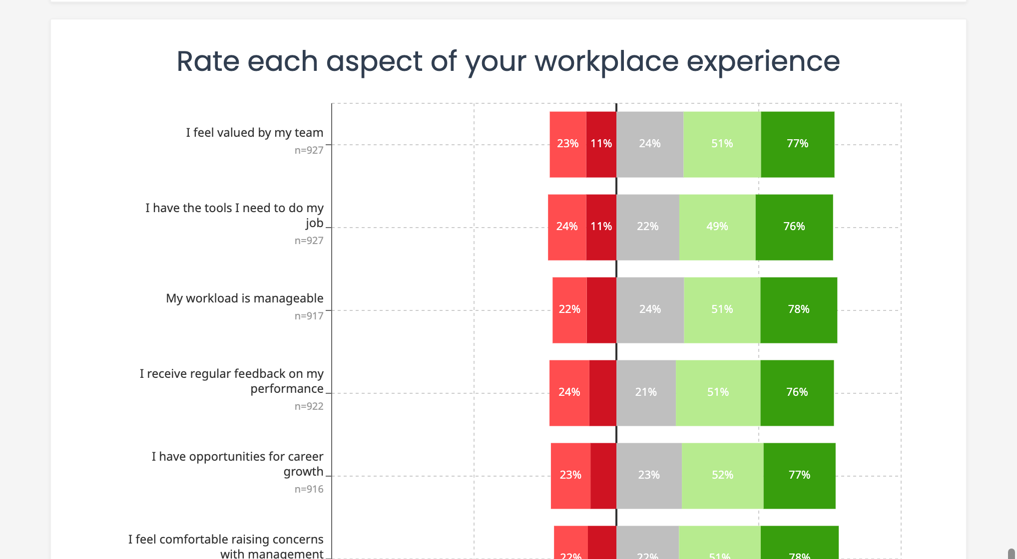
Best for: Agreement scales, satisfaction ratings, Likert-type questions.
Stacked distribution
Compares the distribution of responses across multiple questions or groups in a single stacked view.
Best for: Comparing multiple related questions, showing how distributions differ across groups.
Cross-tabulation
A matrix that shows the relationship between two questions. Each cell displays the count or percentage of respondents who selected a particular combination of answers.
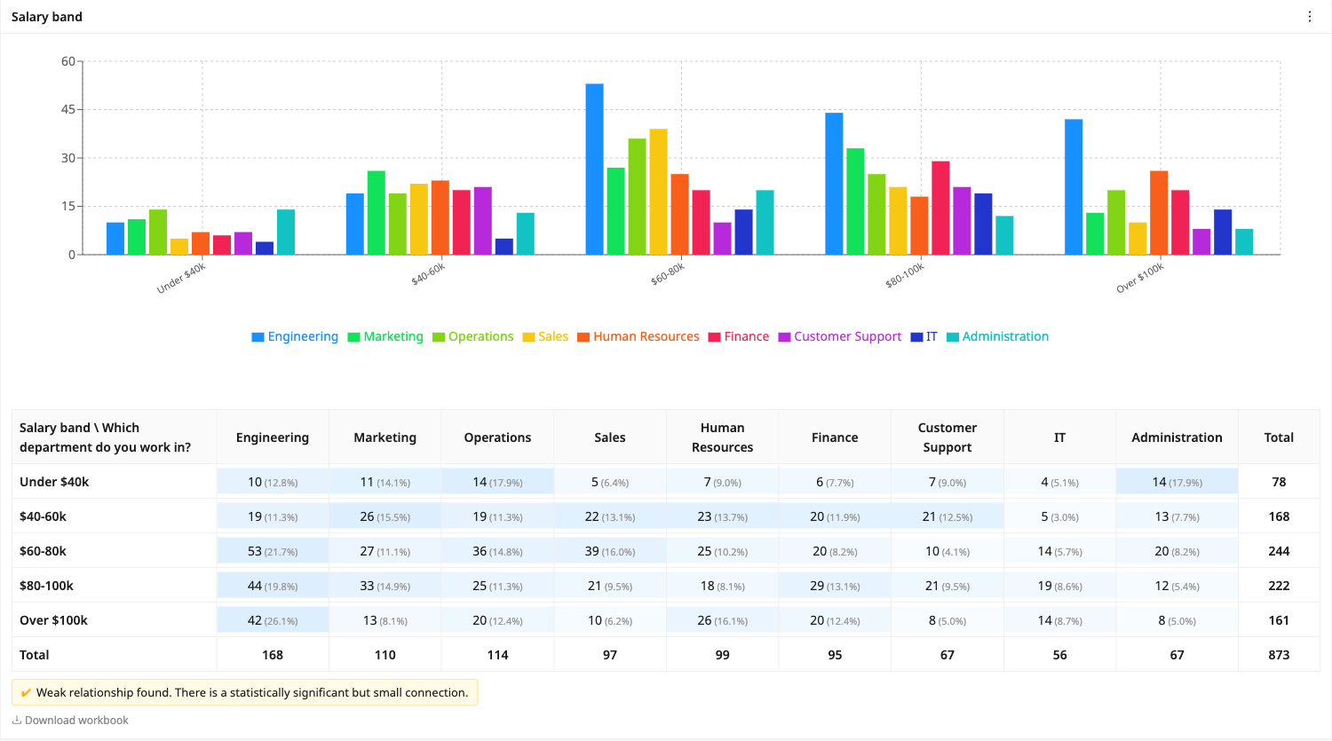
Best for: Exploring relationships between variables, demographic breakdowns, comparing subgroups.
Over-time chart
Plots response data along a timeline based on when responses were submitted. Shows trends and patterns over time.
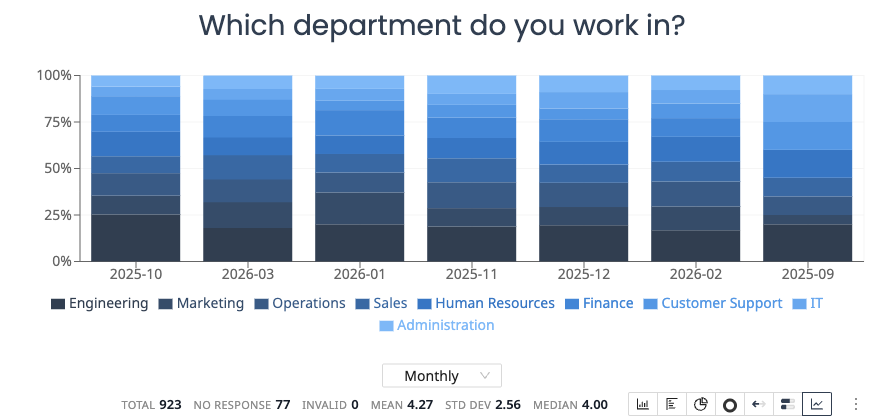
Best for: Tracking changes over days, weeks, or months. Identifying response volume patterns.
NPS chart
Displays Net Promoter Score results with the score breakdown and overall NPS value.
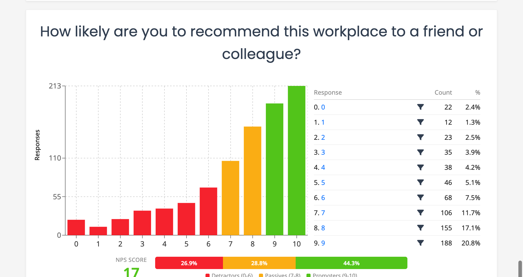
Best for: Net Promoter Score questions, measuring customer loyalty or employee advocacy.
Sentiment analysis
Displays the sentiment breakdown (positive, neutral, negative) for open-ended text responses. Available when Sentiment analysis is enabled on a Short Text or Long Text question.
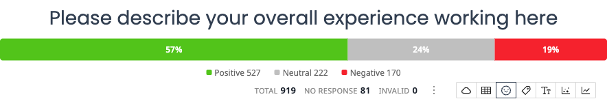
Best for: Understanding the overall tone of free-text feedback.
Topics chart
Shows the most frequently mentioned topics extracted from open-ended responses. Available when Topic analysis is enabled on a Short Text or Long Text question.
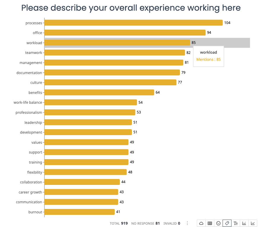
Best for: Identifying common themes in text feedback without reading every response.
Sentiment by topic
Shows the sentiment breakdown for each detected topic, making it easy to see which topics are discussed positively or negatively. Available when both Sentiment and Topic analysis are enabled on a Short Text or Long Text question.
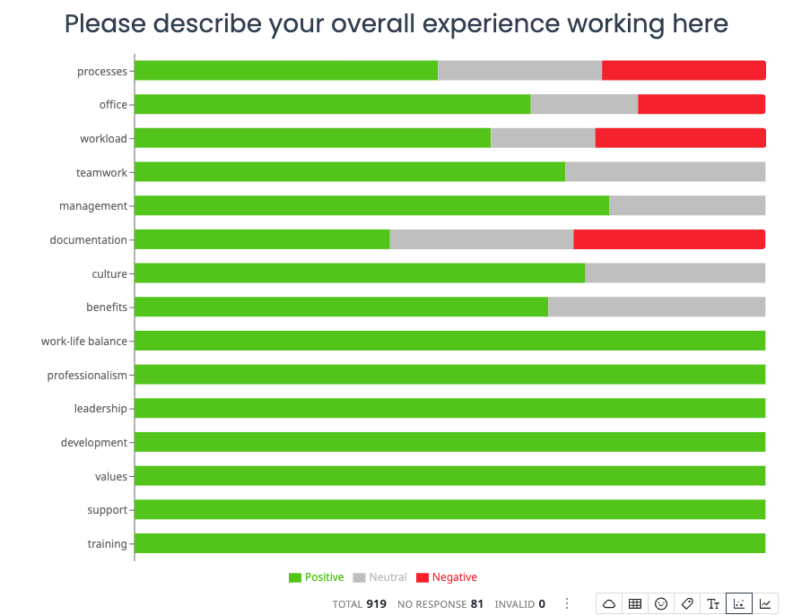
Best for: Understanding which themes drive positive or negative feedback.
Sentiment over time
Tracks how sentiment changes over time, displayed as a stacked area chart with positive, neutral, and negative segments.
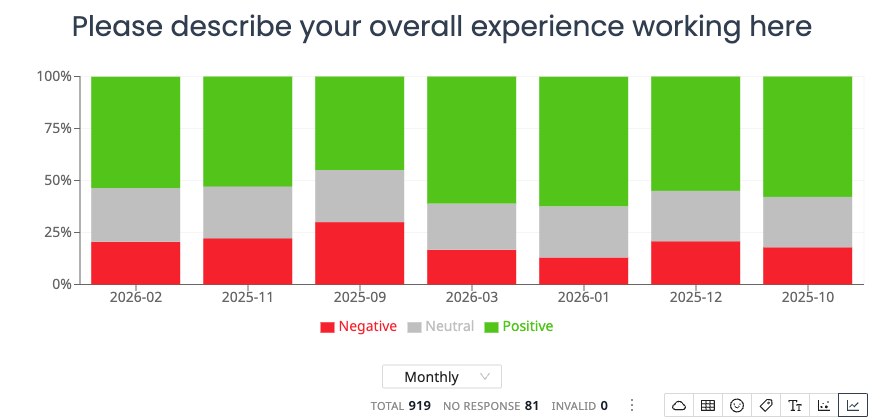
Best for: Monitoring shifts in feedback tone across different time periods.
Word cloud
Visualizes the most frequent words from open-ended responses, with word size indicating frequency.
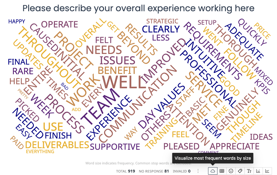
Best for: Getting a quick visual overview of the language used in text responses.
Geographic map
Plots postcode or zip code data on a map, showing the geographic distribution of responses.
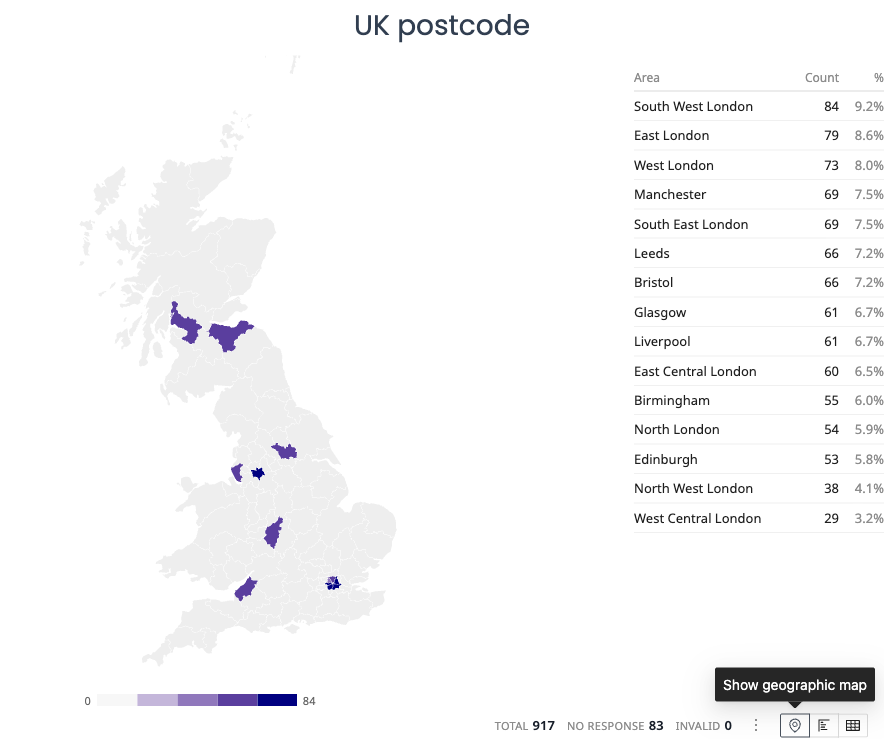
Best for: Postcode and zip code questions, understanding regional response patterns.
Key phrases chart
Highlights the most common phrases used in text responses.
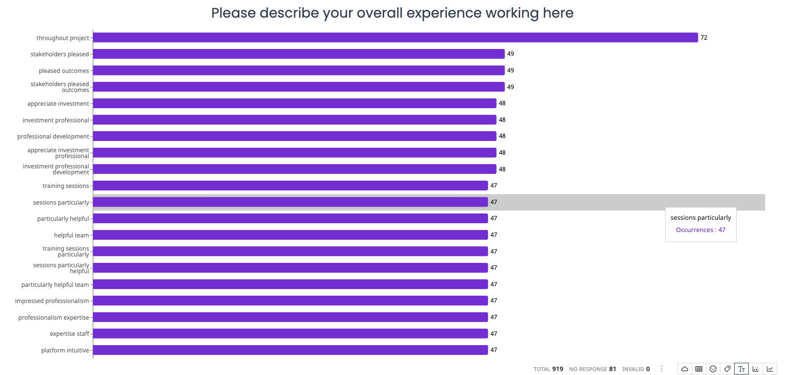
Best for: Discovering specific language and terms respondents use frequently.
Test and exam analysis charts
When grading is enabled on a survey, additional chart types become available to analyze test and exam performance.
Test results overview
Shows summary statistics (average score, median, high, low, pass/fail counts) and a list of frequently missed questions. Appears automatically at the top of the Results tab for graded surveys.
Score distribution
A histogram showing how scores are distributed across all respondents. When a pass threshold is set, bars are colored green (pass) or red (fail).
Item difficulty
A horizontal bar chart showing the percentage of respondents who answered each question correctly, color-coded by difficulty zone (green for easy, yellow for moderate, red for difficult). Includes a discrimination index per question.
Score over time
A trend chart showing how average scores change over time, with respondent counts per period.
For more details, see Test and Exam Analysis Charts.
Choosing the right chart
| Question type | Recommended chart |
|---|---|
| Single choice | Bar, pie, or horizontal bar |
| Multiple choice | Bar or horizontal bar |
| Rating scale / Likert | Likert bar or stacked distribution |
| NPS (0-10 scale) | NPS chart |
| Two questions compared | Cross-tabulation |
| Trends over time | Over-time chart |
| Open-ended text | Sentiment, topics, word cloud, or key phrases |
| Postcode / zip code | Geographic map or bar chart |
| Quiz / exam questions | Quiz overview, item difficulty, score distribution |
Each widget can be changed to a different chart type at any time, so feel free to experiment until you find the visualization that best communicates your findings.