Two surveys with identical questions can produce different data if they are laid out differently. This is not a theoretical concern. Decades of research in survey methodology demonstrate that visual design, spacing, question order, and formatting choices measurably affect how respondents interpret and answer questions.
Don Dillman and colleagues have documented these effects across multiple editions of their Tailored Design Method, and experimental studies in journals like Public Opinion Quarterly, Field Methods, and the Journal of Survey Statistics and Methodology have replicated them. The evidence is clear: questionnaire layout is not cosmetic. It is methodological.
Visual Design Principles from Research
Tourangeau, Couper, and Conrad (2004), in a widely cited paper in Public Opinion Quarterly, identified three heuristic principles that respondents use to interpret visual features of survey questions:
Middle means typical. Respondents interpret the visual midpoint of a scale as the "normal" or "average" response. If your scale is visually off-center due to uneven spacing, you will shift responses.
Left and top mean first. In left-to-right reading cultures, the first option listed (top or left) receives a slight primacy advantage. Respondents are marginally more likely to choose options they encounter first.
Near means related. Items placed close together are perceived as conceptually related. Items separated by white space or visual dividers are perceived as distinct.
These principles apply to both paper and web surveys, but they are easier to control on paper because every respondent sees the same fixed layout. On web surveys, screen size, browser zoom, and responsive design can alter the visual relationships you intended.
Spacing and White Space
Dillman, Smyth, and Christian (2014) demonstrated experimentally that the amount of space between response options affects how respondents use rating scales. When response categories are evenly spaced, respondents treat the intervals as equal. When spacing is uneven, respondents infer that closer options are more similar and distant options are more different.
This finding has practical implications for paper form design. If your checkboxes for a 5-point satisfaction scale are not evenly spaced (perhaps because you compressed the layout to fit more questions on a page), you may introduce systematic measurement error.
Christian, Parsons, and Dillman (2009) tested the effect of visual spacing in open-ended questions. Larger answer boxes on paper forms elicited longer responses. Respondents used the size of the answer space as a cue for how much detail was expected. A small box suggests a brief answer. A large box suggests a detailed one.
For paper surveys, this means you can influence response length by design. If you want detailed qualitative feedback, allocate generous space for the answer. If you want a short factual response, use a smaller field.
Font Size, Typeface, and Readability
Research on form design consistently shows that readability affects completion rates and data quality.
Dillman et al. (2014) recommend a minimum font size of 10 points for body text and 12 points for older respondent populations. Fonts below 8 points increase item non-response (questions skipped by the respondent) and form abandonment.
For paper surveys specifically, serif fonts (like Times New Roman) and sans-serif fonts (like Arial or Helvetica) perform equivalently in readability studies, but consistency matters more than the specific choice. Mixing fonts within a questionnaire creates visual noise and reduces the professional appearance that encourages completion.
Bold and italic formatting should be used sparingly and consistently. Bold is effective for question stems. Italic works for response instructions ("Please mark one"). Using both randomly undermines the visual hierarchy that helps respondents navigate the form.
Question Order Effects
The sequence in which questions appear affects responses. This is among the most robust findings in survey methodology.
Schuman and Presser (1981), in their foundational work Questions and Answers in Attitude Surveys, documented multiple types of order effects:
- Contrast effects. Rating a mediocre product after an excellent one produces lower ratings than rating the same mediocre product first.
- Consistency effects. After answering one question in a certain direction, respondents tend to answer related questions consistently.
- Saliency effects. Earlier questions prime concepts that influence how later questions are interpreted.
The practical recommendation from Dillman et al. (2014) is to place easy, non-threatening questions first to build engagement, group related questions together, and place sensitive or demographic questions at the end. This sequencing reduces break-off rates and primes respondents positively for the survey experience.
On paper forms, question order is fixed for all respondents. This eliminates the randomization option available in web surveys but also eliminates the confound of different respondents seeing different sequences.
Checkbox Design and Mark Recognition
For paper surveys processed by OMR (Optical Mark Recognition), the design of checkboxes and response areas directly affects both the respondent experience and the accuracy of automated processing.
Research from the U.S. Census Bureau's questionnaire design studies (Dillman, 2000) established several principles:
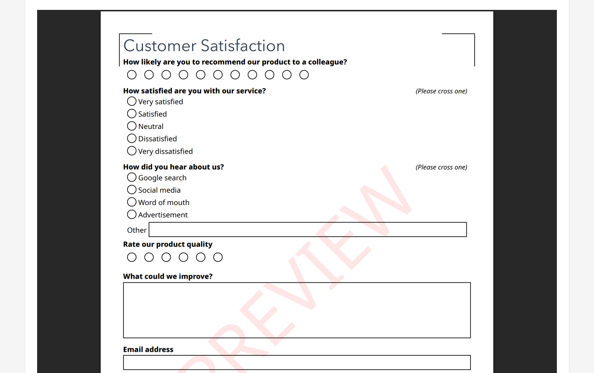
- Checkbox size matters. Larger checkboxes (4mm+) are easier for respondents to mark accurately, especially for older adults or respondents filling out forms on unstable surfaces.
- Shape consistency. Use circles for single-choice questions and squares for multiple-choice questions. This visual convention helps respondents understand whether they can select one or many options.
- Alignment. Vertically aligned response options with left-aligned checkboxes are easier to scan and complete than horizontal layouts for questions with more than four options.
- Spacing between options. Adequate vertical spacing between checkboxes reduces the risk of ambiguous marks that fall between two options.
PaperSurvey.io generates forms with OMR-optimized checkbox sizing and spacing. Each form includes alignment markers and QR codes that the processing engine uses to locate response fields precisely, even when scans are slightly skewed or off-center.
Grid (Matrix) Questions: Use With Caution
Grid questions (matrices where multiple items share the same response scale) are space-efficient and visually organized. They are also prone to specific quality problems.
Couper, Traugott, and Lamias (2001) found that grid questions produce more straight-lining (selecting the same response for every item) compared to the same items presented as individual questions. Respondents process grids faster and less carefully.
Tourangeau, Couper, and Conrad (2013) confirmed that grid layouts encourage satisficing behavior, particularly when the grid is long (more than 7-8 rows). Respondents develop a rhythm of marking the same column repeatedly rather than reading each item carefully.
The practical recommendation: Use grids for up to 5-7 items when the items are clearly distinct and respondents are motivated. For longer batteries, break them into smaller grids separated by other question types. Avoid grids entirely for critical measurement items where response quality is paramount.
On paper forms, grids have an additional advantage: they are visually anchored. The column headers are always visible because the page does not scroll. This eliminates the web survey problem where respondents in a long grid lose sight of which column corresponds to which response label.
Page Breaks and Visual Flow
For multi-page paper surveys, where you break the page affects how respondents process the questionnaire.
Dillman et al. (2014) recommend never splitting a question across two pages. If a question and its response options cannot fit on the current page, move the entire question to the next page. Split questions increase skip rates and confuse respondents.
Similarly, a grid question should never be split across pages. If your matrix does not fit on one page, reduce the number of items or use a smaller layout.
Page numbering and section headers help respondents track their progress, which research shows reduces abandonment. A respondent who can see they are on "Page 3 of 4" or "Section 2: Your Experience" is more likely to continue than one who has no sense of how much remains.
Color and Shading
Dillman (2000) found that alternating row shading in grid questions improved tracking accuracy. Respondents were less likely to mark the wrong row when alternating light and white backgrounds distinguished adjacent items.
Color can also be used functionally: a light background color for instruction text distinguishes it from question text. However, heavy use of color on paper forms increases printing costs and can cause problems with OCR processing if dark backgrounds reduce the contrast between marks and the form surface.
For forms that will be processed by OMR, use color sparingly and ensure that response areas maintain high contrast (dark marks on a light background).
The Cumulative Effect
No single design choice will make or break your survey. But the cumulative effect of many small decisions, spacing, fonts, checkbox size, question order, grid length, page breaks, adds up. A well-designed questionnaire that follows evidence-based principles will produce measurably better data than one thrown together without attention to layout.
PaperSurvey.io applies many of these principles automatically. Forms generated by the platform use consistent spacing, properly sized checkboxes, clear section headers, and OMR-optimized layouts. You focus on the questions. The platform handles the visual design.
References
- Christian, L. M., Parsons, N. L., & Dillman, D. A. (2009). Designing scalar questions for web surveys. Sociological Methods & Research, 37(3), 393-425.
- Couper, M. P., Traugott, M. W., & Lamias, M. J. (2001). Web survey design and administration. Public Opinion Quarterly, 65(2), 230-253.
- Dillman, D. A. (2000). Mail and Internet Surveys: The Tailored Design Method (2nd ed.). Wiley.
- Dillman, D. A., Smyth, J. D., & Christian, L. M. (2014). Internet, Phone, Mail, and Mixed-Mode Surveys: The Tailored Design Method (4th ed.). Wiley.
- Schuman, H., & Presser, S. (1981). Questions and Answers in Attitude Surveys: Experiments on Question Form, Wording, and Context. Academic Press.
- Tourangeau, R., Couper, M. P., & Conrad, F. (2004). Spacing, position, and order: Interpretive heuristics for visual features of survey questions. Public Opinion Quarterly, 68(3), 368-393.
- Tourangeau, R., Couper, M. P., & Conrad, F. (2013). "Up means good": The effect of screen position on evaluative ratings in web surveys. Public Opinion Quarterly, 77(S1), 69-88.
Start your free trial and design a professionally formatted paper survey in minutes.